Basalt charts
Dreaming of a new chart type
This is a Gantt chart
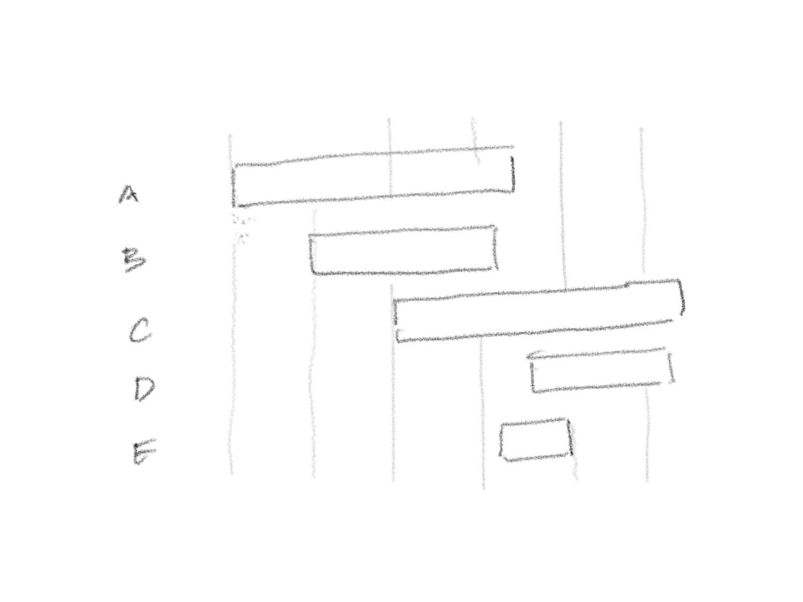
It shows the starts and ends of a series of events, over a common timeline. The length of the bar shows the duration of the event. It’s a fairly common tool used in project and task management.
This is a 2x2 matrix
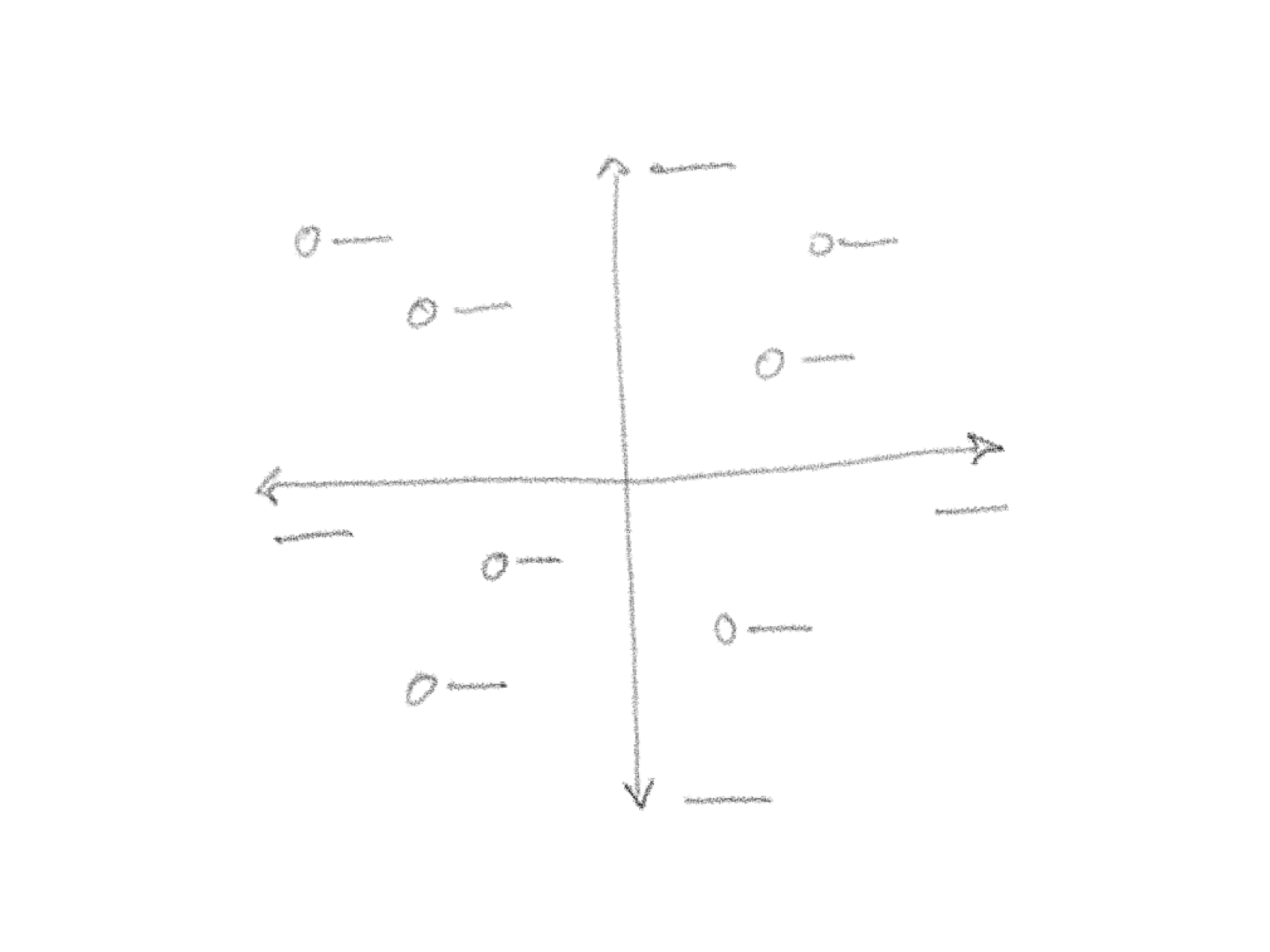
The 2x2 chart, a darling in decision making and management, is loved because of its simplicity and flexibility in explaining ideas across 2 opposite poles on 2 axes. Those poles can be quantitative or qualitative.
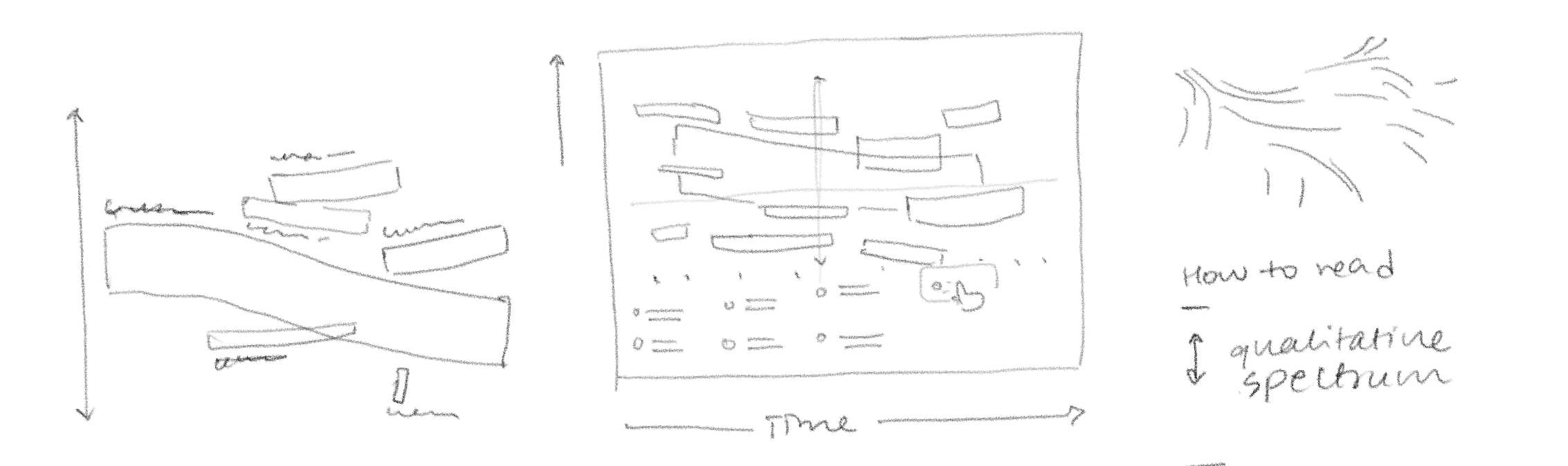
What if we were to combine aspects of these two to make a Gantt chart with not just magnitude, but direction too? How would this work?
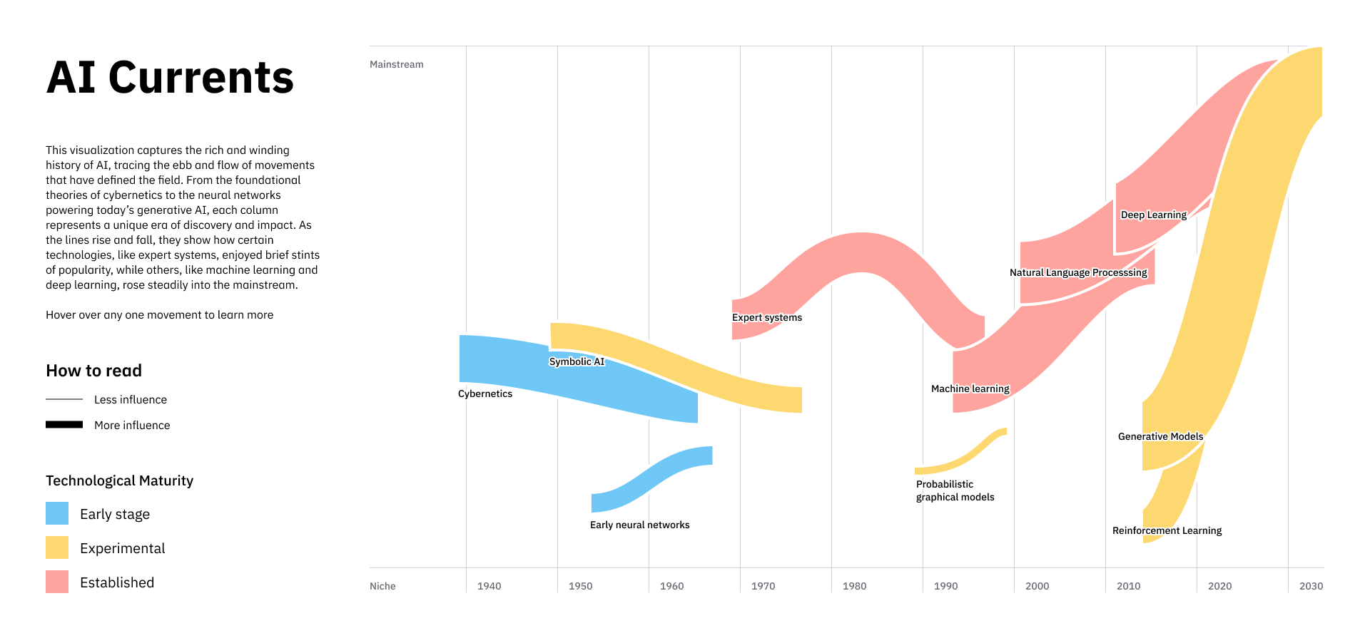
- Each event could show a sway, along a qualitative axis. This doesn’t have to strictly adhere to the extremes of the axis, and result in a sharp rise or fall in the bar. Even a slight tilt would communicate the change.
- The start and end would have to be accurate, just like the original Gantt chart. There would be no unambiguous endings to the stroke of the bar.
- Could be used to show changes in the quality of an event. Like movements that started closely aligned but changed in nature over time.
I’d imagine this could work on static media, but with some effort to read. With some interactivity, however, the possibilities are exciting.
Data can be encoded along
- Length, or magnitude
- Direction
- Proximity
- Colour
- Width, or thickness
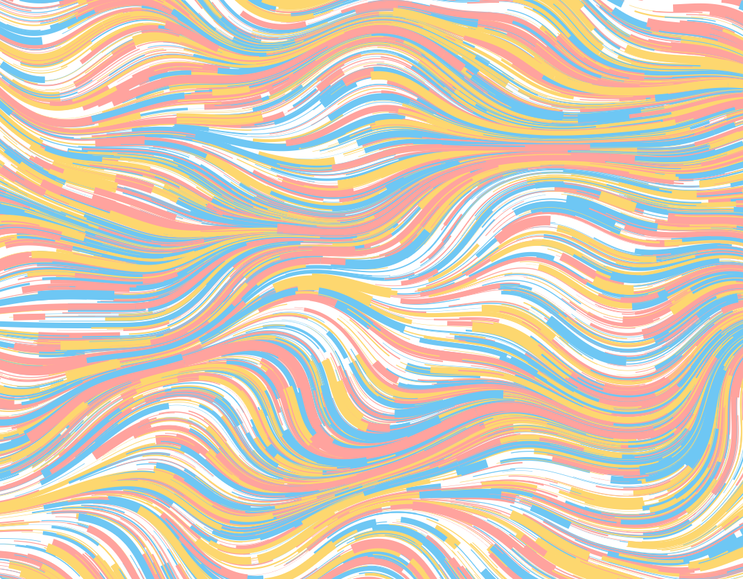
This started off as a series of sketches in class, after looking at basalt rock columns. They’re formed as lava flows and cools itself into polygonal pillars. If this would actually prove of any use, maybe we can call them basalt charts!
 Vibe coded using Claude
⚠️ This is a work in progress I’m refining this chart type with a richer dataset, more to come soon!